Mobile app
Mobile app
Mobile app
Caja los Andes - Credit activation
My role
My role
My role
UX/UI designer
UX/UI designer
UX/UI designer
Company
Company
Company
Caja Los Andes
Caja Los Andes
Caja Los Andes
Duration
Duration
Duration
1 month
1 month
1 month
Project type
Project type
Project type
Mobile app
Mobile app
Mobile app
Contribution
Contribution
Contribution
Analysis
Analysis
Analysis
Flow process
Flow process
Flow process
High-fidelity Prototype
High-fidelity Prototype
High-fidelity Prototype
Tools
Tools
Tools
Miro
Miro
Miro
Figma
Figma
Figma
Monday
Monday
Monday
About
About
About
Caja Los Andes is a non-profit Private Law Corporation. Its social role is directly connected to managing social security benefits and improving the quality of life for its members.
Caja Los Andes is a non-profit Private Law Corporation. Its social role is directly connected to managing social security benefits and improving the quality of life for its members.
Project details
Project details
Problem definition
The health credit flow was underutilized by members due to its design and navigation complexities. To improve the user experience, we needed to redesign the flow for clarity and ease of use.
The health credit flow was underutilized by members due to its design and navigation complexities. To improve the user experience, we needed to redesign the flow for clarity and ease of use.
The health credit flow was underutilized by members due to its design and navigation complexities. To improve the user experience, we needed to redesign the flow for clarity and ease of use.
Design criteria
I redesigned the mobile app user journey for a smoother and more intuitive experience. This included analyzing user behavior, defining the ideal flow, and refreshing the app's aesthetics.
I redesigned the mobile app user journey for a smoother and more intuitive experience. This included analyzing user behavior, defining the ideal flow, and refreshing the app's aesthetics.
I redesigned the mobile app user journey for a smoother and more intuitive experience. This included analyzing user behavior, defining the ideal flow, and refreshing the app's aesthetics.
My role
My role involved reviewing and analyzing the existing web flow, collaborating with the development team, and redesigning it based on the current services.
My role involved reviewing and analyzing the existing web flow, collaborating with the development team, and redesigning it based on the current services.
My role involved reviewing and analyzing the existing web flow, collaborating with the development team, and redesigning it based on the current services.
Analysis
Analysis
I analyzed the user flow and the screens of the web, identifying key areas for improvement.
I analyzed the user flow and the screens of the web, identifying key areas for improvement.
Excessive Clicks Required:
Excessive Clicks Required:
Excessive Clicks Required:
Users faced multiple unnecessary clicks to navigate the app, impeding their ability to easily activate credits, which was a key objective.
Navigation Text:
Navigation Text:
Navigation Text:
The access text repeated "Ver" (View) excessively, which was confusing.
The access text repeated "Ver" (View) excessively, which was confusing.
The access text repeated "Ver" (View) excessively, which was confusing.
Low Contrast & Small Fonts:
Low Contrast & Small Fonts:
Low Contrast & Small Fonts:
A lack of contrast and small fonts created accessibility issues within the interface, impacting users' ability to read and navigate.
A lack of contrast and small fonts created accessibility issues within the interface, impacting users' ability to read and navigate.
A lack of contrast and small fonts created accessibility issues within the interface, impacting users' ability to read and navigate.
Outdated Design:
Outdated Design:
Outdated Design:
The outdated design not only frustrated users but also limited our ability to meet evolving user expectations.
Unoptimized UI:
Unoptimized UI:
Unoptimized UI:
The interface components were not mobile-optimized, resulting in a confusing user experience on mobile devices.
The interface components were not mobile-optimized, resulting in a confusing user experience on mobile devices.
The interface components were not mobile-optimized, resulting in a confusing user experience on mobile devices.

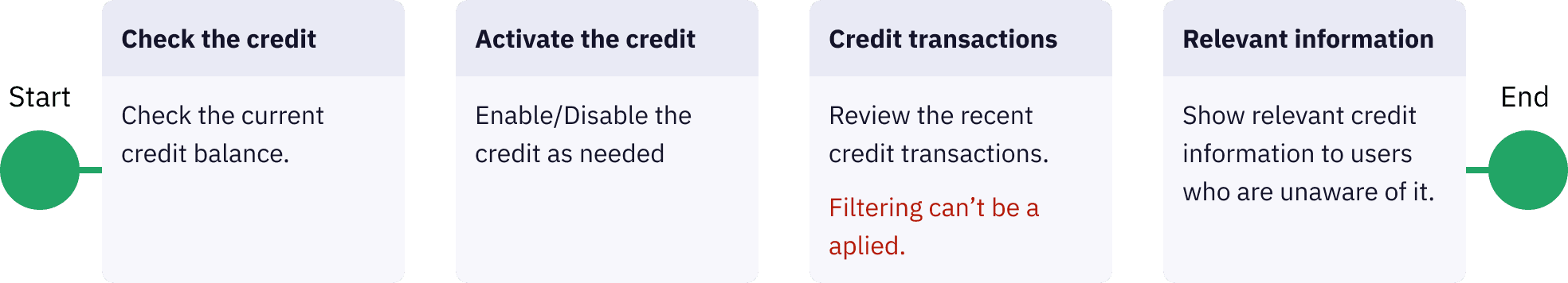
Flow process
Flow process
I collaborated with the development team to design the flow and implement improvements based on the current services.
I collaborated with the development team to design the flow and implement improvements based on the current services.
Design solution
Design solution
I enhanced product consistency using the design system and developed new components to match the flow.
I enhanced product consistency using the design system and developed new components to match the flow.
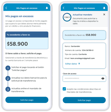
Fewer Clicks, Clearer Labels:
Fewer Clicks, Clearer Labels:
Fewer Clicks, Clearer Labels:
I simplified the process with fewer clicks and clear labels, making it easier for users to complete.
I simplified the process with fewer clicks and clear labels, making it easier for users to complete.
I simplified the process with fewer clicks and clear labels, making it easier for users to complete.
Improving accessibility:
Improving accessibility:
Improving accessibility:
The interface was updated to align with the new design system, ensuring high contrast and larger fonts for improved accessibility.
The interface was updated to align with the new design system, ensuring high contrast and larger fonts for improved accessibility.
The interface was updated to align with the new design system, ensuring high contrast and larger fonts for improved accessibility.
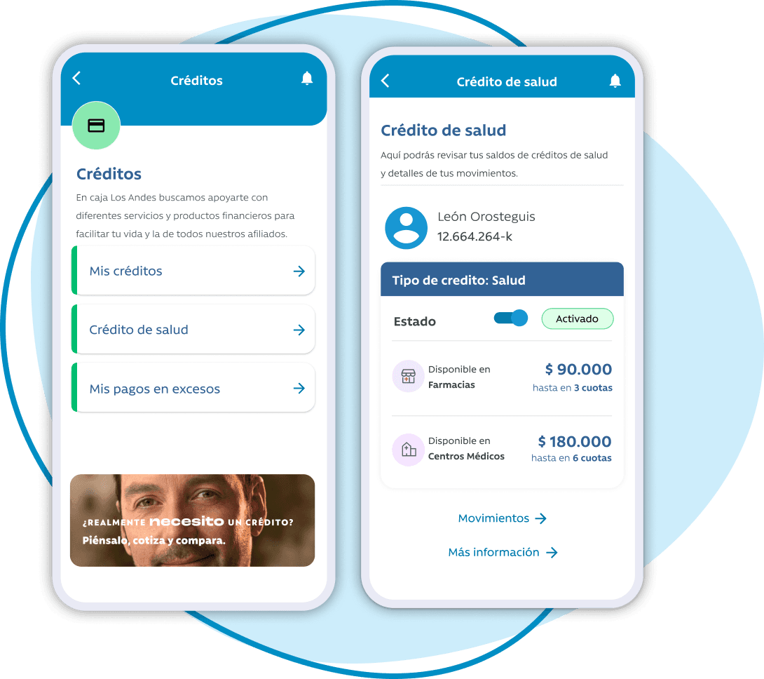
Improved functionality:
Improved functionality:
Improved functionality:
To enhance the mobile app experience, I integrated new components and reorganized the information for easier navigation.
To enhance the mobile app experience, I integrated new components and reorganized the information for easier navigation.
To enhance the mobile app experience, I integrated new components and reorganized the information for easier navigation.
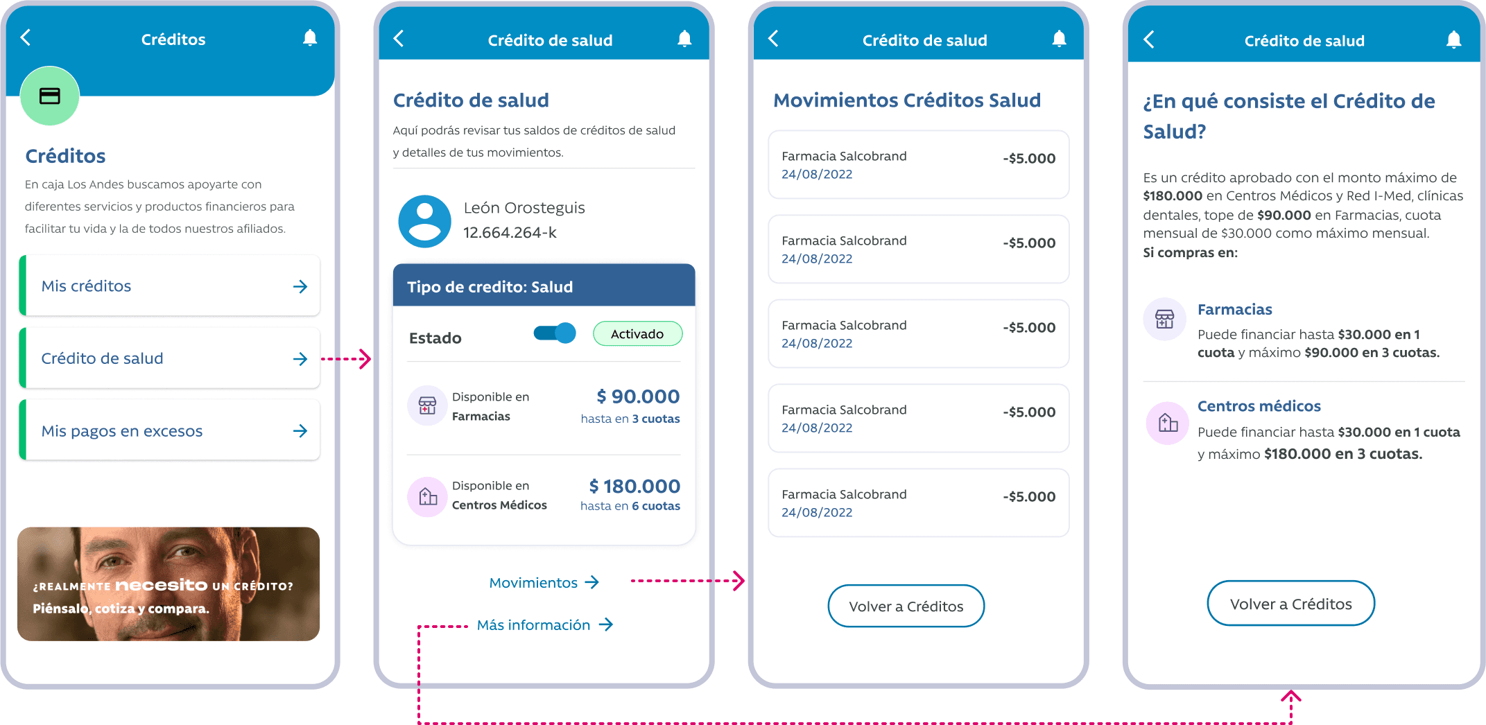
Some decisions behind the design
Simplified navigation to take the user straight to the credit view.
Switched button designed for enable and disable the credit.
Card component displaying information according to the user needs.
Switched table to card layout for better mobile app usability.
Prioritized key information for improved user understanding.